
Last Updated on August 17, 2026 by Ellen Christian
A poorly designed pool float just disappears. The colors wash out, the shape goes flat, and the whole thing melts into the background like a forgotten pool noodle. That’s a real missed opportunity, especially when the float is carrying a logo, a name, or a message you actually want people to notice.
Posts may be sponsored. This post contains affiliate links, which means I will make a commission at no extra cost to you should you click through and make a purchase. As an Amazon Associate I earn from qualifying purchases.
The floats that photograph well don’t get there by accident. Here are five specific design details that separate the ones worth sharing from the ones nobody screenshots.
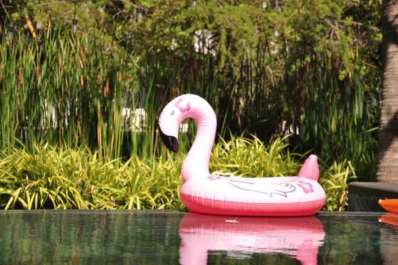
Bold, Saturated Color Palettes That Resist Wash-Out
Color is the first thing a camera picks up, and often the first thing sunlight, water, and glare start to fade. Deep magenta, electric blue, and vivid coral tend to hold their intensity better than lighter shades under strong midday light, while pastels can look washed out in photos. Saturation plays a real role in how a float reads in pictures, and products such as https://custominflatables.com/pages/custom-pool-floats go into more detail on how color choices affect this.
When you’re picking a palette, think about how those colors will read against light blue water and white pool decking. High-contrast pairings – navy against white, or bright orange against black – stay sharp and legible whether someone’s shooting from a drone, standing on the pool deck, or just pointing their phone. Skip the subtle gradients. A camera sensor compresses tonal range, and that delicate ombré effect simply won’t survive the shot.
Graphic Scale That Works From a Distance
Details that look intricate in a design file often become invisible in photos. The general rule is to scale up far beyond what feels comfortable on screen; a logo or illustration covering only a quarter of the float’s surface will read as a smudge from ten feet away. Your main graphic should take up at least 60 to 70 percent of the float’s largest visible face.
Text follows the same logic. Anything smaller than what you’d put on a highway billboard tends to get lost. But size alone isn’t the whole picture. Negative space around the main element matters too; a cluttered float with too many competing graphics looks chaotic in photos, while one large, confident image gives the camera something clear to lock onto. Simplicity scales. Clutter doesn’t.
RELATED: What do consider when designing an inflatable arch
Defined Edges and Strong Outlines
Cameras struggle with shapes that blend softly into their surroundings. On a pool float, any graphic without a strong outer outline risks looking smeared or undefined in photos, especially when the float’s partially submerged or backlit by afternoon sun. Adding a thick, contrasting border (called a stroke in most design software) around logos, text, and illustrations creates the visual separation that holds up under compression and low-light conditions.
Black outlines on bright shapes work. White outlines on dark shapes work just as well. The minimum effective width depends on the float’s size, but for anything in the four-to-six-foot range, a half-inch stroke on the printed design is a solid starting point. Floats headed for branded events or product launches benefit from even heavier outlines; the truth is, those floats are almost always photographed quickly, in mixed lighting, from half a dozen different angles at once.
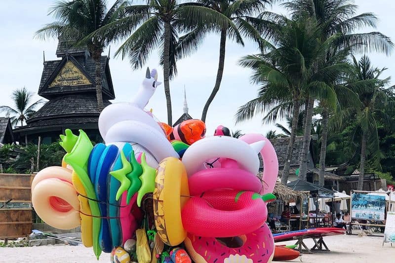
Shape That Reads as Three-Dimensional
A flat rectangular float is genuinely hard to make interesting in a photo. Custom die-cut shapes – food items, logos, animals, characters – give the float a clear silhouette that registers instantly in any image, even before the viewer can make out the printed details. So shape matters. A lot.
But shape alone isn’t enough. The best photo-ready floats pair a distinctive outer form with surface printing that sells the three-dimensional illusion: shadows painted directly onto the vinyl, subtle shading that mimics depth, highlights placed where light would naturally catch a rounded surface. If you’re designing a float shaped like a slice of pizza, printing realistic cheese texture and shadow beneath the toppings makes the whole thing look sculptural even in a flat overhead shot. And that’s what makes people stop scrolling, something that looks like it has weight and dimension, not just a colored rectangle floating in water.
Personalization Details That Create a Story
A float carrying a name, a date, a brand mark, or a custom inside joke does something generic designs simply can’t: it gives the photo a reason to exist and a reason to get shared. People post floats when the float actually means something: a birthday, a brand launch, a team event. That specificity is one of the most direct levers you have over whether a float gets picked up on social media.
Personalization has to be legible, though. Names and short messages work best in bold sans-serif fonts at large sizes, placed on the flattest, least-curved section of the float where text won’t distort. Honestly, script fonts are risky for anything under two inches in the final print; fine strokes lose definition fast. And think about placement from a photo perspective; text on the side of a float often gets cut off, while text on the top face stays visible from nearly every shooting angle.
Conclusion
The design details that make custom pool floats stand out in photos come down to a handful of consistent principles: saturated colors that resist glare, graphics scaled for real-world distances, strong outlines that hold up under compression, shapes that suggest depth, and personalization that gives the image a reason to be shared. None of these demand a complicated design process, but all of them need to be deliberate decisions made before production starts. Get these right, and the float earns its own social media presence long after the event wraps up.

Ellen is a busy mom of a 29-year-old son and 33-year-old daughter. She owns nine blogs and is addicted to social media. She believes that it doesn’t have to be difficult to lead a healthy life. She shares simple healthy living tips to show busy women how to lead fulfilling lives. If you’d like to work together, email info@confessionsofanover-workedmom.com to chat.
